Logo design and new image for David Barat
BRAND STRATEGY
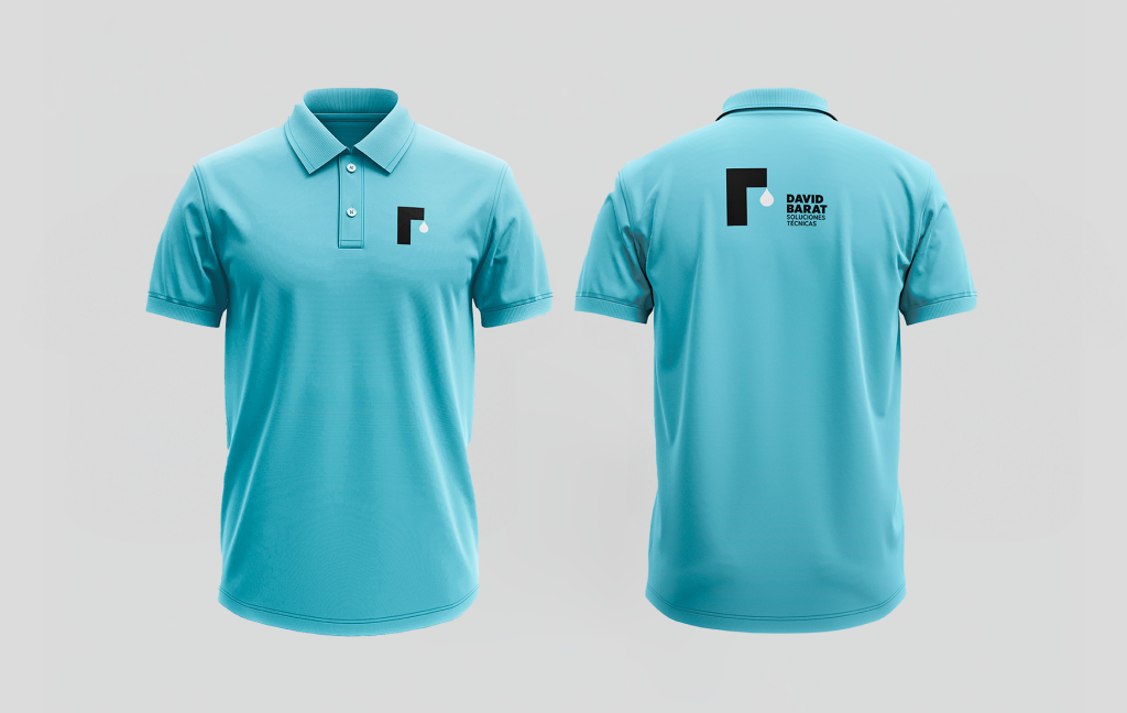
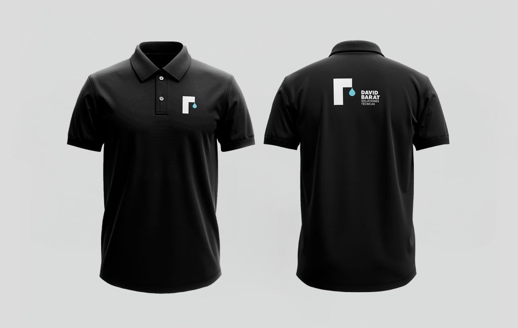
David Barat Soluciones Técnicas' design reflects a carefully crafted branding strategy that combines simplicity, symbolism, and communicative clarity to stand out in the technical solutions market. This logo is distinguished by its economy of elements, using a solid colour background and a limited colour palette to create significant visual impact without resorting to saturation.
The logo design features an abstract shape reminiscent of the letter "F" and a symbolic silhouette of a water droplet, capturing attention and communicating the essence of the solutions the company offers. The water droplet suggests movement and fluidity, alluding to the company's adaptability and efficiency in managing liquid resources. This concept is reinforced by the use of light blue, evoking trust and professionalism.
The layout and typographic style of the logo design, with an emphasis on the name ‘David Barat’ over ‘Soluciones Técnicas’, ensures recognisability and memorability. The modern and professional sans-serif typography contributes to a perception of accessibility and innovation, which are essential qualities in the highly competitive technical solutions sector.
The power of symbolism in its logo design reflects the satisfaction of the service
To sum up, the logo design of David Barat Soluciones Técnicas effectively encapsulates the company's mission and vision: technical excellence and precision in handling complex solutions. This visual identity presents a cohesive image that supports its commitment to innovation and customer satisfaction. The company's branding not only represents a promise to its consumers but also establishes a solid foundation on which the company is committed to building and evolving in the future.
With this focus on design and branding, David Barat firmly positions itself as a leader in the sector, offering technical solutions with an image that reflects professionalism and commitment.


